
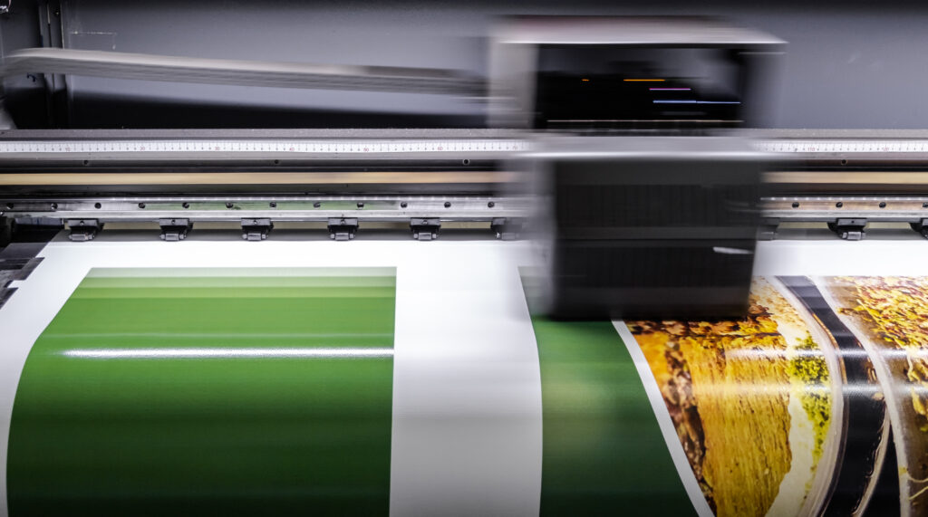
Marketing teams today juggle digital ads, email campaigns, social content—and yes, print. From direct mail to event signage to donor reports, printed materials still play a vital role in multichannel campaigns.
But if you don’t speak the language of your print vendor, it’s easy to miscommunicate, stall projects, or blow your budget.
Our guide is designed to give marketers a working knowledge of print terms so you can ask smarter questions, approve projects faster, and keep quality high.
How to Use This Guide Print Marketing Terms Guide
You don’t need to memorize everything here. Think of it as your go-to reference, something to skim before sending your next job to print, reviewing a proof, or choosing materials for a campaign.
Bleed
Design that extends slightly beyond the edge of the finished piece.
Why it matters: Without it, you risk white edges after trimming. Always include a bleed (usually 1/8″) in your file setup.
CMYK vs. PMS
CMYK is the standard four-color process (Cyan, Magenta, Yellow, Black). PMS stands for Pantone Matching System, a library of specific ink colors.
Why it matters: CMYK works for most jobs, but PMS is more accurate when color consistency is critical, like in logos or branded materials.
DPI (Dots Per Inch)
The resolution of your image for print.
Why it matters: 300 DPI is standard. Anything less, and your image might look blurry or pixelated when printed.
Proof
A preview of your print job.
Why it matters: It’s your last chance to catch errors. Always review it carefully—what you approve is what gets printed.
Trim Size vs. Finished Size
Trim size is the cut size of the paper. Finished size is what the final piece measures after folding or binding.
Why it matters: These details affect layout, envelopes, and even postage rates.
Stock
The paper your project is printed on.
Why it matters: Paper choice affects everything from how your piece feels in someone’s hands to how colors appear on the page. There are countless options—coated vs. uncoated, glossy vs. matte, heavy vs. lightweight—and each creates a different impression. Thicker stock conveys formality and durability, ideal for invitations or high-end brochures. Lighter stock is more cost-effective for bulk mailings or inserts.
Your choice of stock also impacts things like mailing weight, postage costs, and how easily a piece folds. For example, an uncoated, textured stock may look refined but might not work well with certain ink finishes or postal equipment. When in doubt, request samples or consult with your print partner (like Fenway Group) to match the paper to your project’s purpose, budget, and brand feel.
Variable Data Printing (VDP)
A printing method that lets you personalize each piece with different names, images, or text.
Why it matters: Variable data printing lets you personalize each piece—names, images, messages—without slowing down production. It’s ideal for donor outreach, customer segmentation, or campaigns where relevance drives results, all while keeping printing efficient.
G7 Certification
A printing industry standard for consistent color across devices and substrates.
Why it matters: Fenway Group holds this certification, which means your colors stay consistent across all print jobs, no surprises.
Binding
Common types include saddle-stitched (stapled), perfect-bound (glued), coil-bound (spiral).
Why it matters: Binding affects both look and function. Use saddle-stitch for short booklets, perfect binding for polished reports, and coil binding when the piece needs to lie flat. The right choice depends on page count, use case, and how you want the piece to be handled.
Die Cut
Custom-shaped cuts in printed materials.
Why it matters: Die cuts create visual and tactile interest, helping your piece stand out—great for folders, packaging, or interactive mailers. Just keep in mind they add cost and production time.
Imposition
The layout of pages on a printer’s sheet to ensure they appear in the correct order once printed, folded, and trimmed.
Why it matters: Especially important for booklets, catalogs, or anything bound—improper imposition can result in pages out of order or upside down.
Coating (Aqueous, UV, Varnish)
A finish applied to printed materials to protect them or change their texture/appearance.
- Aqueous: Fast-drying, water-based, and commonly used for a subtle sheen.
- UV: High-gloss, cured under UV light—very durable.
- Varnish: A traditional coating that can be matte, gloss, or satin.
Why it matters: Coatings can enhance design and durability—important for postcards, menus, or anything handled frequently.
Score and Fold
A score is a crease made before folding to prevent cracking. A fold is the physical action of bending the paper.
Why it matters: Scoring creates a clean crease that prevents cracking or uneven folds, especially on thicker paper stocks. Without scoring, folds can look sloppy or damage the ink and coating. For brochures, cards, or any folded piece meant to look polished, scoring is essential for a professional finish.
Live Area / Safe Zone
The area within the trim line where all critical content (text, logos) should stay.
Why it matters: The live area is the safe zone for critical content like headlines, logos, or contact information. Anything placed outside this margin risks being trimmed off during production. Even small shifts in cutting can impact alignment, so keeping key elements within the live area ensures your design prints exactly as intended—clean, centered, and complete.
Registration
The alignment of color plates in CMYK printing.
Why it matters: Poor registration leads to blurry or misaligned prints, especially noticeable in text or sharp graphics.
Putting Print Marketing Terms Into Practice
This knowledge becomes practical quickly. If you’re designing a fundraising mailer and want to personalize messaging by donor tier, variable data printing (VDP) is the tool to ask for. If your designer sends over a file without bleed, you’ll know to have it added before submission to avoid trimming issues. Planning a branded event? Use PMS colors to ensure visual consistency across all materials.
Understanding these basics helps you communicate more clearly with your print partner—and makes for smoother, more successful projects.
Work with Fenway Group For Your Next Print Project
At Fenway Group, we bridge the gap between creative vision and flawless execution. Our team doesn’t just “take files and print”—we collaborate, problem-solve, and help you make smarter production choices. Whether it’s a short-run brochure or a complex multichannel campaign, we’re here to make it easy.
Send a file to us today.